BROKERED by:

LET US EXCEED YOUR EXPECTATIONS
We aim to surpass expectations and demonstrate client care through expertise, commitment, and skills. Real Estate transforms lives. We deliver experiences worth reliving.


OUR RECENT BLOGS

Quick gut reaction. Which investment do Americans trust more than stocks, gold, savings accounts, and bonds? The answer hasn't changed in 14 years. It's real estate. And this year, that answer comes with even more conviction behind it. New data shows people aren't just saying homeownership is a smart move, they're feeling better about it than they have in years. Let's dig into why. Real Estate Takes the Top Spot – Again Every year, Gallup asks Americans to name the best long-term investment. And for the 14th year in a row, real estate came out on top ( see graph below ):
If you’ve thought about buying a home in the past few years, you may have run into two frustrations: asking prices that kept climbing and too few homes to choose from. In many places, both sticking points are letting up this summer, with lower asking prices and more homes for sale. Let’s look at the trends, and what they mean for your search. Sellers Are Pricing To Attract Buyers According to Realtor.com , the national median asking price was $430,000 in June, nearly $11,000 under what it was the year before ( see graph below ):

Saving for a down payment can feel like the hardest part of buying a home. And with affordability as tight as it’s been lately, it’s fair to wonder how anyone manages it right now. Here’s something you may not have seen coming. Some people are getting their foot in the door with a smaller down payment. According to Realtor.com, the typical buyer put down about $23,400 in early 2026 – that's around $5,000 below what was typical the year before (a 19% drop year over year). That’s the lowest down payments have been since 2021 (see graph below):
TESTIMONIALS
SELLER'S/LISTING INFO
LEARN MORE
BUYER'S INFO
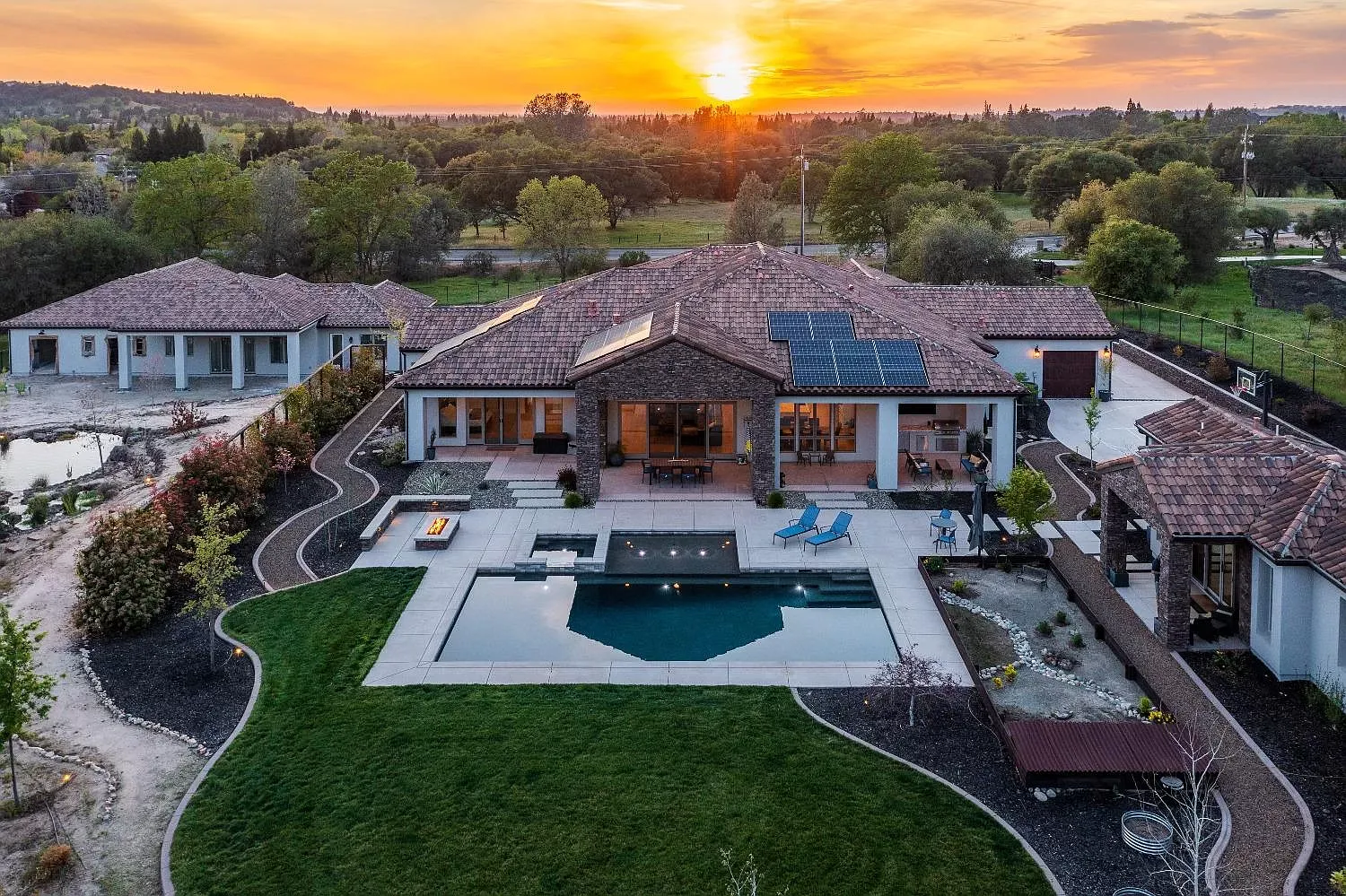
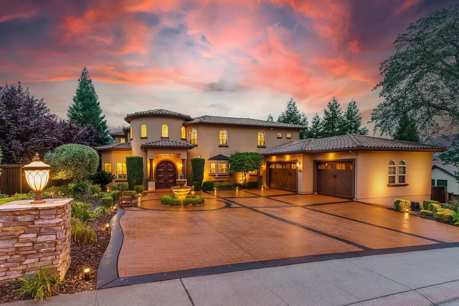
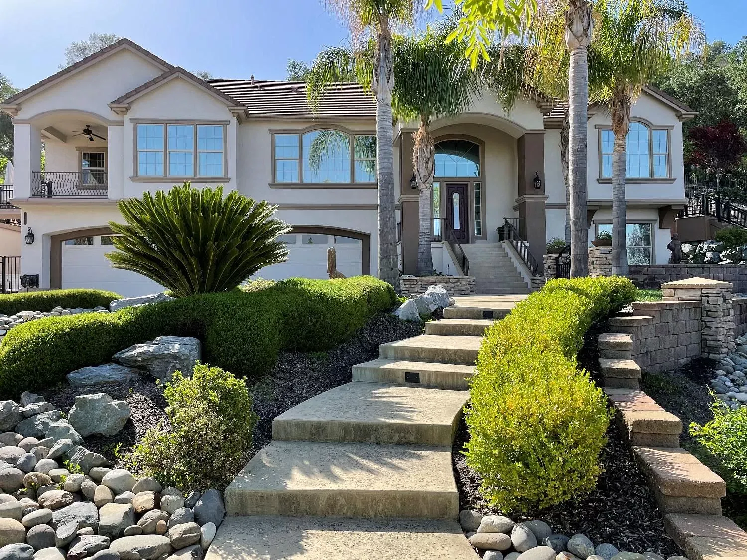
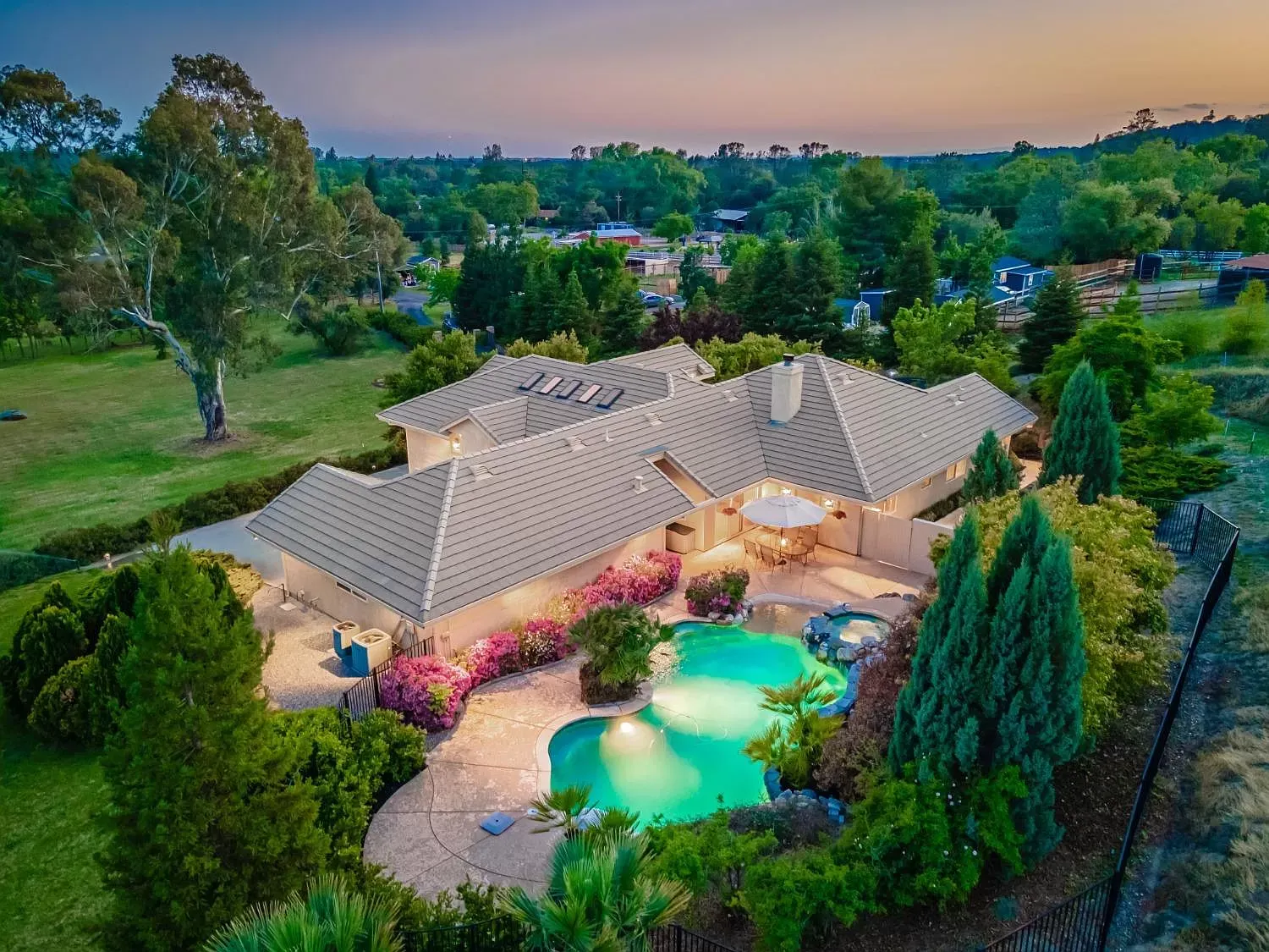
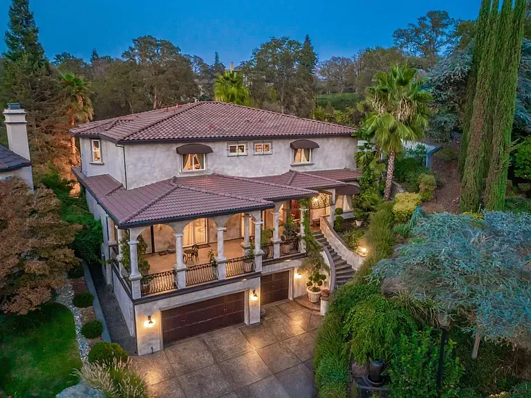
LEARN MOREfeatured Listings


OUR MOVING TRUCK
We’re excited to be a part of your exciting moving day and want to help you make your moving experience top-notch all the way through the moving process from "selling to moving" or "buying to moving “ were excited to be here to help you and appreciate the dedication to our business.